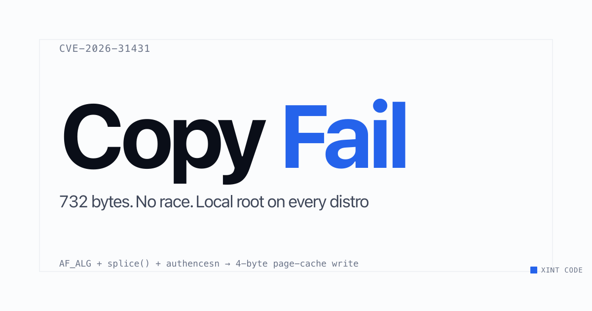
On 29 April 2026, a Korean security firm called Theori published 732 bytes of Python that breaks Linux container isolation. CopyFail (CVE-2026-31431) is a page-cache corruption bug in the kernel's crypto code. It's been sitting in production since 2017. A compromised pod on a shared Kubernetes node can corrupt setuid binaries visible to every other container on that host, and to the host kernel itself. EKS, GKE, AKS, every shared-tenant node, every CI runner, every multi-tenant SaaS that took the cheap path on isolation - all exposed until patched. It took an AI tool four months to find it. Nine years of human eyes did not.
Container escape is bad. Despite arguably a poorly coordinated disclosure/mitigation response, it looks like a near miss rather than a catastrophe. But, this class of bug - old, subtle, in a corner of the kernel that everyone assumed someone else had read - is exactly the class of bug that lives in every hypervisor stack underneath every cloud. Those bugs are still there. They just haven't been found yet.
Here's a (fictional) story about what happens four months from now, on 29th August 2026.
08:32 UTC
As Europe basks in an extreme heatwave, many engineers are paged as with EC2 instances hard crashing. Hacker News reacts to the news as per normal - another us-east-1 outage, AWS status showing green, eyes roll. Some commenters post though that many other AZs are showing issues, though not all servers are affected.
Over the next hour though, more and more machines go down. One Reddit user posts that they are having issues provisioning even fresh machines - as soon as they launch, they get moved into "unhealthy" and go down. A few minutes later, the entire AWS dashboard and API set goes down.
Cloudflare Radar shows AWS network traffic dropping to a small percentage of what is normal.
10.15 UTC
As many AWS hosted services start going down - Atlassian, Stripe, Slack, PagerDuty, some comments on Twitter report issues with Linux-based Azure instances. Indeed, Cloudflare Radar shows significant drops in Azure traffic.
News channels across Europe start leading with vague breaking news headlines on outages across Amazon. They make sure to point out that this isn't an unusual occurrence, with normal service expecting to be resumed like it always has been, and mistakenly insist only US services are affected.
11.53 UTC
As the East coast of the US starts their weekend, a very unusual step is taken. TV channels are briefed that POTUS will be doing an address to the nation at 8am EDT. Few connect the dots - with the emphasis being placed on a potential new strike in the Middle East, or an announcement on the Russia-Ukraine war.
12:00 UTC
POTUS announces that there is a significant cybersecurity incident under way. The head of CISA (the Cybersecurity and Infrastructure Security Agency) gives a very vague but concerning warning. Americans are requested to charge their cell phones, and to await further news - reminded that there may be outages on IPTV based services.
POTUS rounds it out by speculating that China is behind the attack, despite his much-heralded reset with Beijing earlier in the year.
Other Western leaders do similar addresses - with European leaders speculating on background it is more likely to be Russia or North Korea than China behind the attack. The French president says "without doubt" this is a nation-state actor. While he doesn't publicly point to a specific country, he says those responsible will be brought to justice.
While these addresses happen, engineers at various banks are battling various outages. Most concerningly, the 1st biggest and 3rd biggest card processors by volume in Europe have stopped accepting payments, returning cryptic error messages. While they have a multicloud strategy, they cannot move workloads off those two clouds successfully.
Google Cloud Platform and smaller cloud providers - unaffected until now - start showing issues. While current workloads are unaffected, the huge spike in demand from enterprises activating their disaster recovery protocols simultaneously completely swamps available compute on alternate providers. One smaller cloud provider tweets they are seeing 10,000 VM creation requests a second, draining their entire spare allocation in less than a minute. CEOs of major banks bombard Google and Oracle leadership with calls, offering blank cheques to secure failover compute. The calls go unanswered.
WhatsApp groups throughout Europe start lighting up with misinformation that money has been stolen, amplified by many mobile apps showing a "we are undertaking routine maintenance" fallback error simultaneously, causing huge lines at ATMs and banks with people trying to withdraw their savings.
15.53 UTC
As the chaos continues to grow, a press release is distributed from the leadership of AWS and Azure:
At approximately 4am EDT this morning a critical and novel vulnerability was exploited in the Linux operating system. This has caused widespread global outages of Linux based virtual machines. Our engineers are working with security services globally to mitigate the impact and engineers across both Microsoft and AWS are working collaboratively to release emergency patches for affected software. Equally we are working hard to understand the impact and will provide regular updates to the media. We sincerely apologize for the impact this is having to our customers and society at large.
Behind the scenes, it is chaos. Engineers have isolated the root causes - a complex interplay of vulnerabilities, with the most critical being an undiscovered logic error in the eBPF Linux subsystem that allows a hypervisor takeover. Curiously no data has been stolen - a mistake in the exploit just leads to machines hard crashing exactly 255 seconds after receiving the malicious payload. A few engineers question the sloppiness here, but leadership doubles down in their private communications with government that it has to be nation state.
The core issue though is that nearly all of Azure and AWS's control plane is down. Attempts to "black start" it results in perpetual failures as various subsystems collapse under the intense traffic from VMs stuck in bootloops.
23:29 UTC
The first VM instances start up again. Restoration is painfully slow, with AWS struggling to get more than 2% of machines back online. Communication internally is severely degraded - with both Slack and Microsoft Teams down instant messaging is out of the question. Amazon's corporate email runs on AWS itself, and Microsoft's on Azure-hosted Exchange. Both are degraded, massively complicating internal communications. An enterprising AWS employee starts an IRC server locally which becomes the main source of communication - restoration efforts start to speed up once this system becomes known about.
Sunday 30th August, 22:01 UTC
Restoration continues, with the worst of the panic dying down. Banks ended up getting priority compute - with POTUS publicly threatening "extreme actions" if major banks are not put to the front of the queue.
Asian stock markets open, triggering multiple circuit breakers. After the 3rd one in a row, Tokyo forces markets to close for the day, other Asian markets follow in quick succession.
One curious question remains though - what was the purpose of this attack? No ransomware was deployed, no data was stolen, and while various terrorist groups claimed responsibility, none of them were believed to be credible.
Meanwhile AWS engineer finally isolates snapshots containing the first known failure. An EC2 instance, provisioned on August 13th. Curiously provisioned on an individual account in eu-west-3 - Paris. The account matches an individual in Lyon, France. French security services are alerted.
Monday 1st September, 05:15 UTC
In an outer suburb of Lyon, France, French anti-terrorism police arrive at an apartment building. A 17 year old teenager is apprehended, along with his grandmother. Two days earlier, his own president had vowed those responsible would be brought to justice. The police chief on the scene passes the information up the chain that the lead was a total dud - there is no chance that the suggested foreign intelligence service was here. A search of the apartment confirms it - nothing found apart from a PS5 mid-FIFA tournament and a 6 year old gaming computer. Neighbours confirm that they've seen no one enter or exit the apartment apart from the two residents, who've lived there for "as long as anyone can remember".
Media arrive on the scene, with a blustered and embarrassed police chief suggesting that it was a bad tip off and for local residents to stay calm.
The decision is made to seize the electronics and release the two "suspects".
07:14 UTC
A couple of digital forensics experts get the seized gaming PC, scanning it for malware. Nothing much of interest is found, and just as they start writing their report up one folder pops up. /opt/security/ps5-homebrew. They take a further look, noting it on the report - not thinking much of it, probably a kid trying to play pirated games. They've seen it before. The image of the machine is uploaded.
10:09 UTC
When the code gets up the chain a few hours later, the whole set of dominoes fall into place. A specialist from the French Agence nationale de la sécurité des systèmes d'information - National Cybersecurity Agency of France - pulls the code from the image. He quickly realises what's happened. The teenager had been quietly mining crypto for months, using the proceeds to rent cheap GPUs on a small European cloud provider, where he ran an uncensored fine-tune of the new Qwen 4 open weights model. He'd been desperately trying to downgrade his PS5 firmware to bypass the latest piracy checks.
Interestingly his coding agent, unbeknown to him, had found the most critical *nix kernel exploit in many decades. Attacking a little known about eBPF module on the PS5 (the PS5, like every PlayStation since the PS3, runs FreeBSD), it managed to a complete takeover of the device. Intrigued, he also asked his coding agent to run it on a Linux server on AWS he ran a gaming forum on - same thing, but curiously he noticed he could see other files on the machine. Annoyingly the VM he rented crashed after a few minutes.
Excitedly, he set up an Azure account - same thing. He asked his coding agent what this meant, and with its usual sycophantic personality started explaining what he could do with this - mining crypto and making him rich beyond his wildest dreams.
The agent came up with a final plan, to deploy the exploit on both Azure and AWS, install a cryptominer. His last known chat log was "is this definitely a great idea?".
The agent responded "You're absolutely right!", and began deploying the code, first to AWS and next to Azure. The agent had built a complex piece of malware that spread across millions of physical servers. However, it hallucinated a key Linux API which resulted in the machines crashing after 255 seconds instead of deploying the cryptominer.
This is fiction. The teenager doesn't exist. Qwen 4 doesn't exist yet either. When it does, an uncensored fine-tune will appear within days, like every prior open-weights release.
Almost everything else in here is real, or close enough that it doesn't matter.
CopyFail is real. A nine-year-old kernel bug, found by an AI tool in a few months that nine years of human eyes had missed. That class of bug - old, subtle, in a corner of the kernel everyone assumed someone else had read - sits in every hypervisor stack underneath every cloud. Those bugs are still in there. They just haven't been found yet, and the rate at which they get found from now on is bounded by GPU hours, not human ones.
The centralisation is the bit that's hard to think clearly about. Most people I talk to about this, even technical people, underestimate how much of modern life is sitting on AWS and Azure. The DR plans I've seen at large enterprises mostly assume there's a cloud to fail over to. They don't really model what happens if the fallback is also down, or if every other org on earth is failing over at the same minute and draining GCP's spare capacity. Almost nobody keeps full cold standby compute. And even the ones that do are sitting on top of hundreds of services that don't: Stripe, Auth0, Twilio, Datadog, every queue and identity provider in the stack. They're all running somewhere, and that somewhere is mostly two companies.
The attribution thing is the bit I'm least sure about, but worth saying anyway. Everyone is worried about nation states. Most of the big incidents that have actually happened turned out to be a kid, a misconfiguration, or someone who didn't really understand what they were doing. The Morris Worm. Mirai. The threat model in most boards' heads assumes a sophisticated adversary. The thing that's actually arriving is an unsophisticated adversary holding tools that are now sophisticated for them.
I wrote this as fiction because I've spent the last few months talking to journalists and other non-technical people about what AI changes for cybersecurity, and the technical version of the argument doesn't land at all. Engineers get it instantly. Everyone else needs to feel what it looks like. So this is what it might look like, more or less. The only bit I'm reasonably confident about is that the date is wrong.
